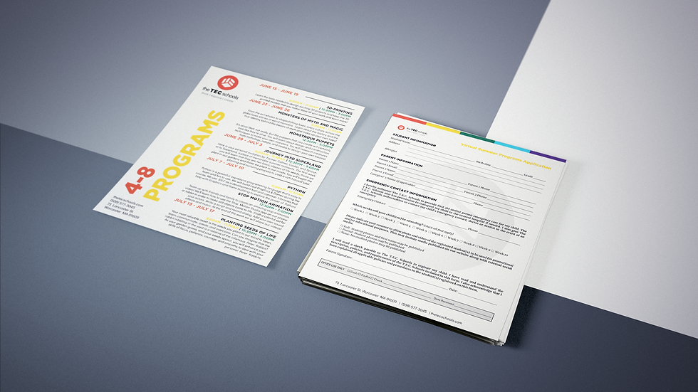
The T.E.C. Schools Branding Packet
The graphic identities of The T.E.C. Schools needed a fresher look, while maintaining the three tenets of Think, Explore, Create.
Like the school, the brand identity will evolve over time. This project arose to meet the need of creating a recognizable branding for the school.
A “brand” is an intangible collection of perceptions that exist in people’s minds. It is how people think and feel about something. In this case, it is how people think and feel about the education at the school. It is the awareness and relevance of The T.E.C. Schools in the minds of the students, parents, staff, and the community at large.
Consistency is crucial to successfully conveying The T.E.C. Schools brand to the public. This graphic identity system is a beginning to clearly defining The T.E.C. Schools visually, and maintaining the consistency necessary for effective communications to the public.
The icon design was inspired by the shape of a cube. As part of the Montessori education provided at the school, the cube appears in a myriad of teaching materials, such as the bead cubes or the pink tower. It is also the shape of a building block, referring to the process of education.
The color scheme for the system was designed to be vibrant and energetic to appeal to both parents and students of the school. The orange serves as the main color identity to symbolize the unique STEAM education at The T.E.C. Schools.
Using the new graphic identity system, I worked with other individuals to redesign the school website.
Visit the school website:
Project Gallery


